
Brand Name: CASA DI PIETRA
Industry: FOOD INDUSTRY

Casa di Pietra
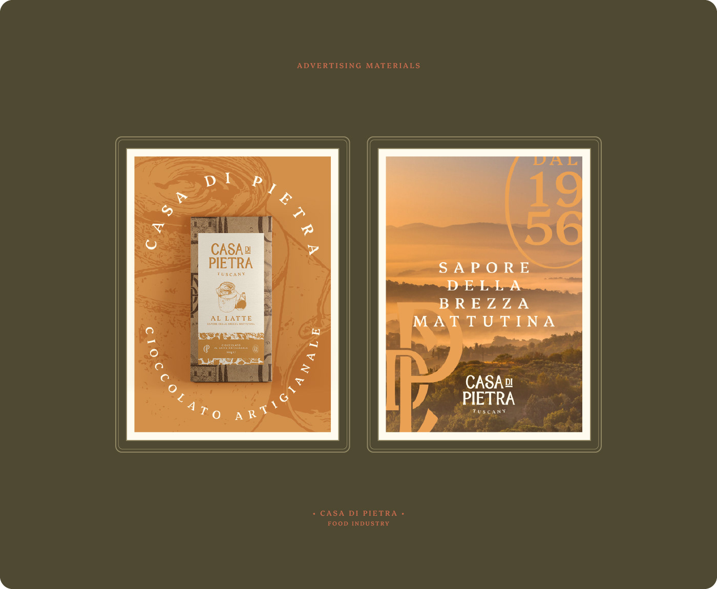
Casa di Pietra is a family chocolate shop that has been making homemade-style chocolates since 1956, deciding to transform this tradition into a serious venture focused on tourism and export. The challenge was creating a brand that would convey to customers the rich history and care involved in artisanal production, preserving deep emotional value.
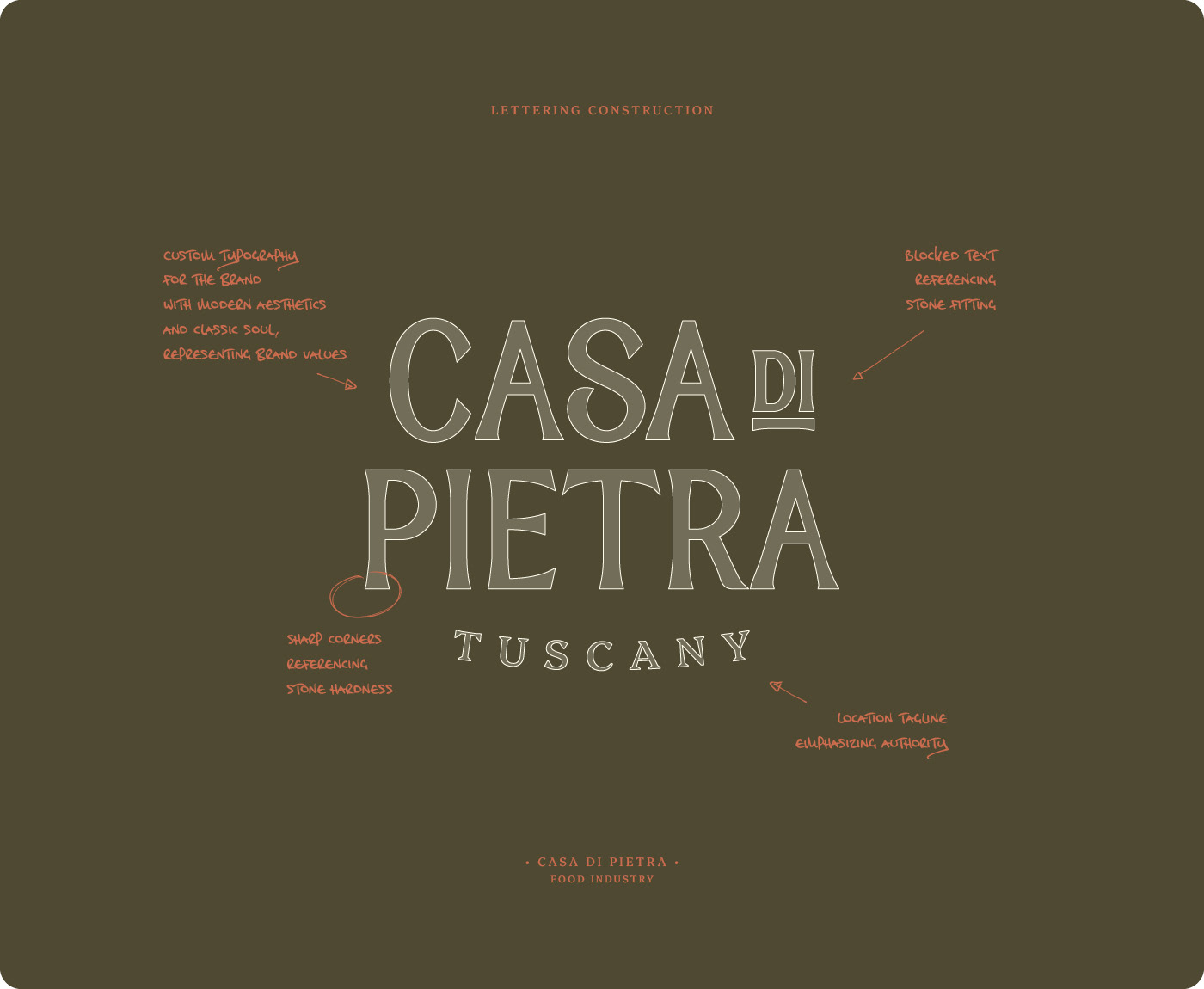
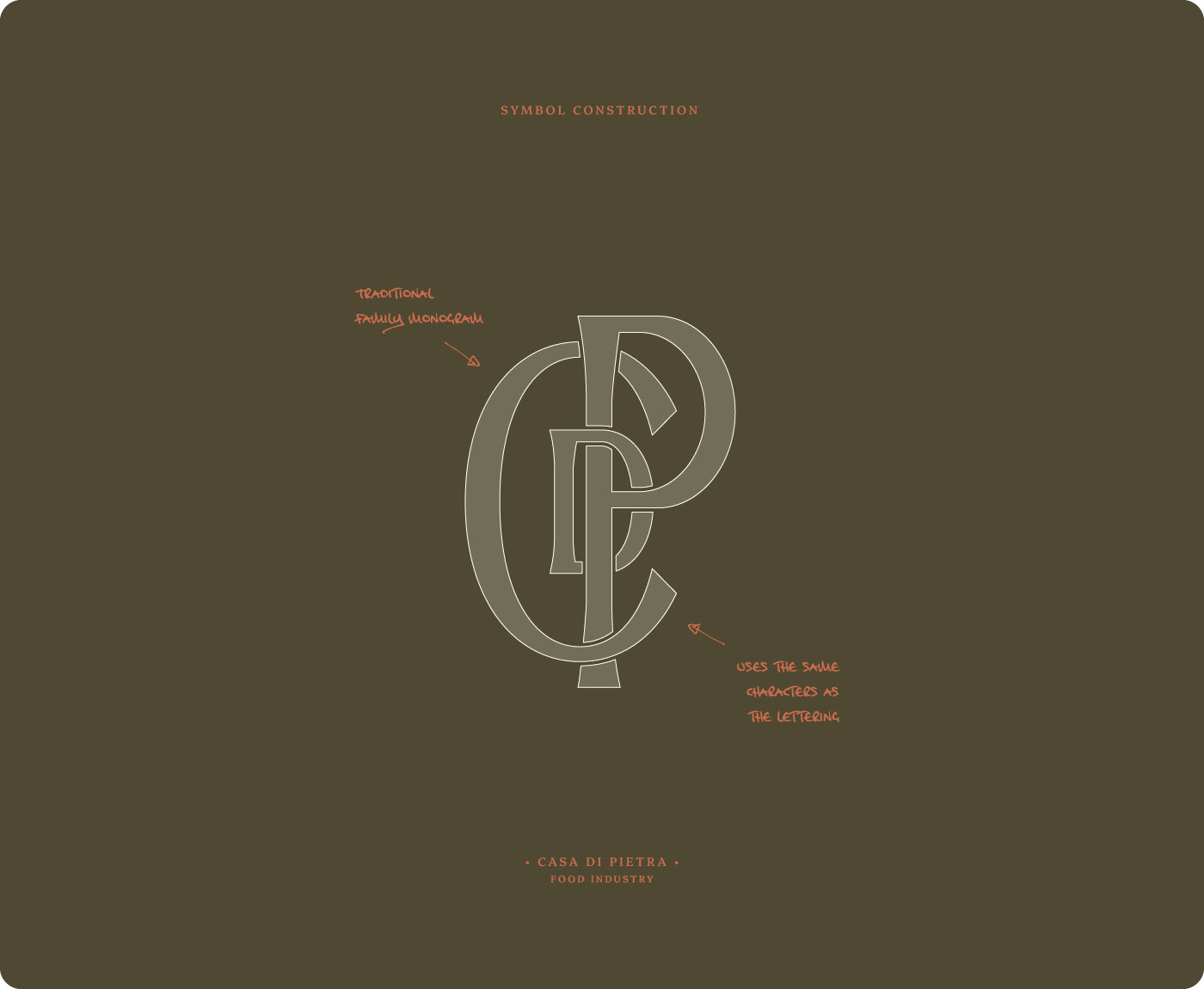
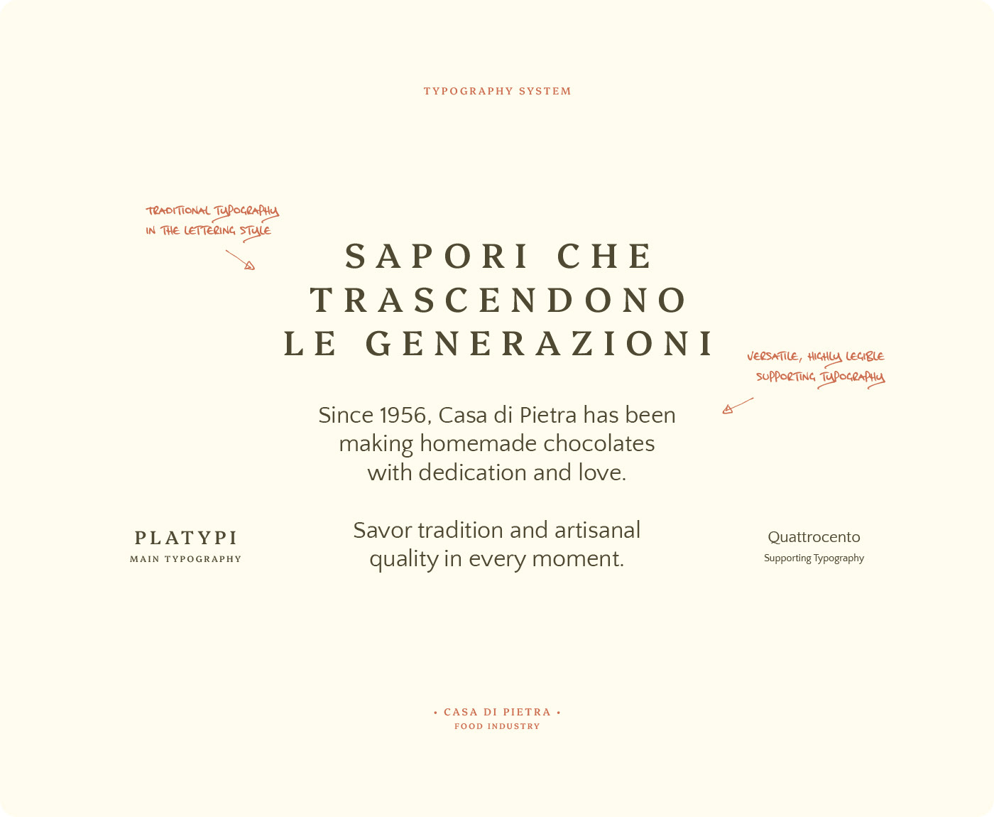
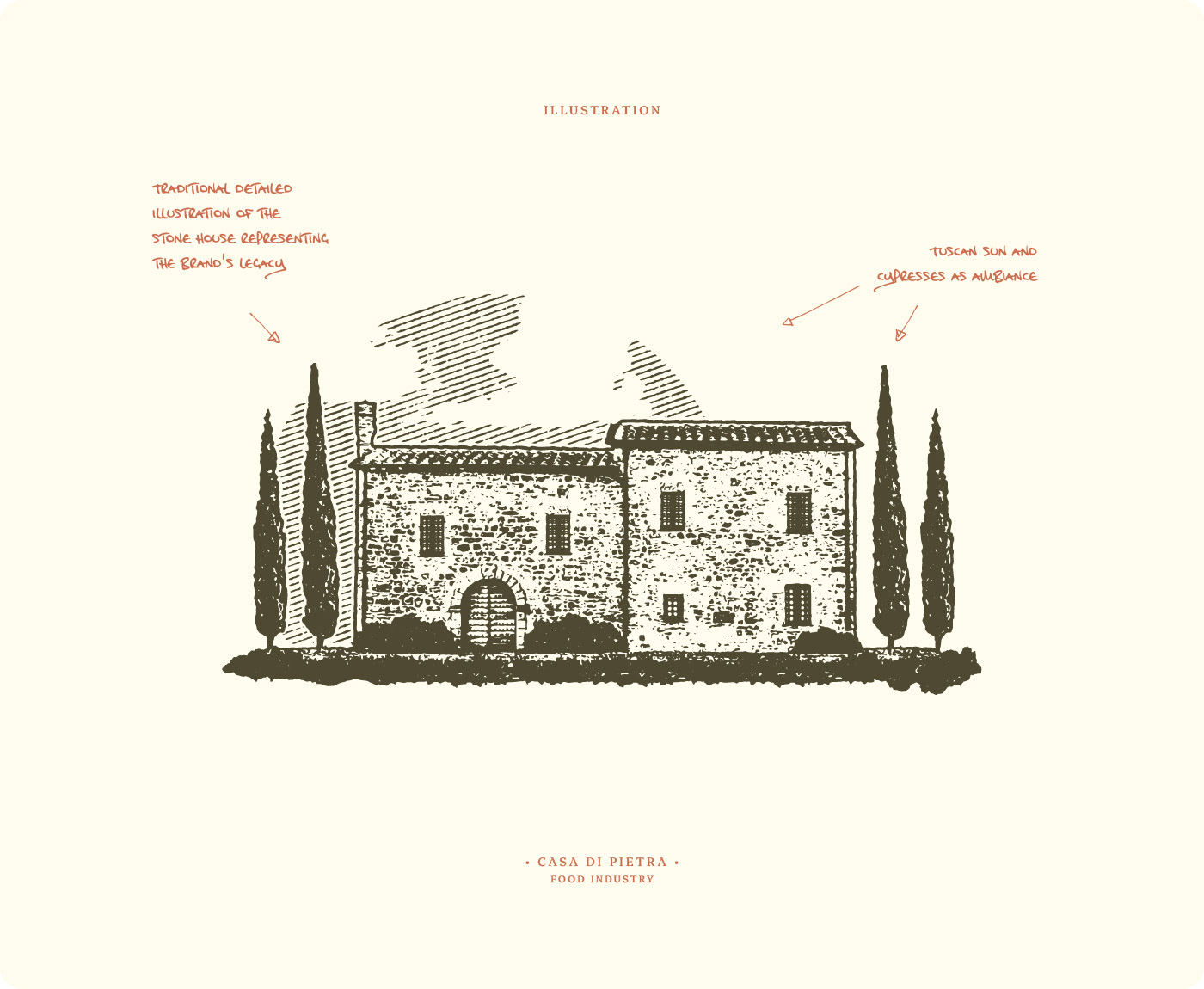
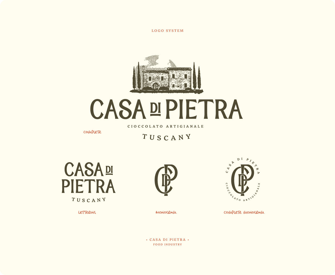
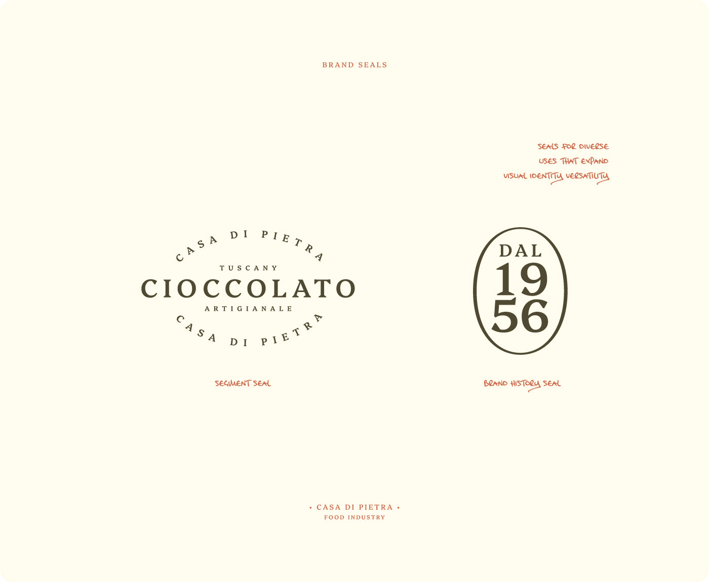
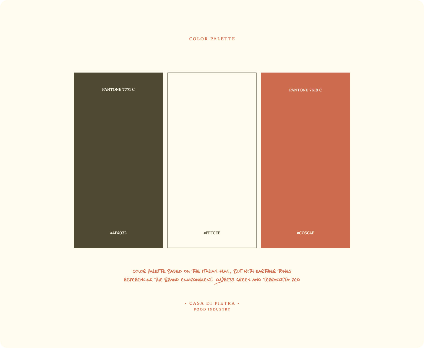
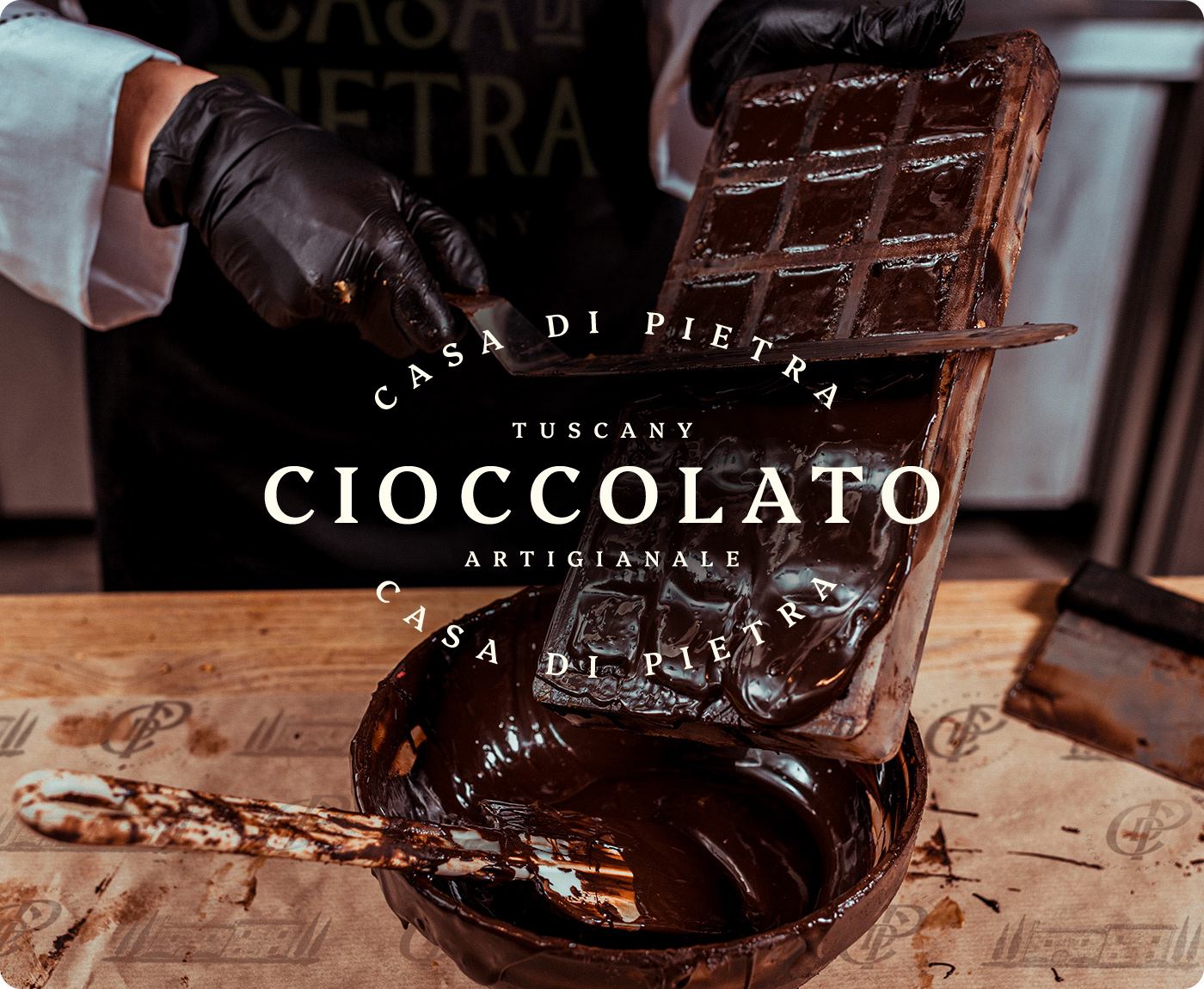
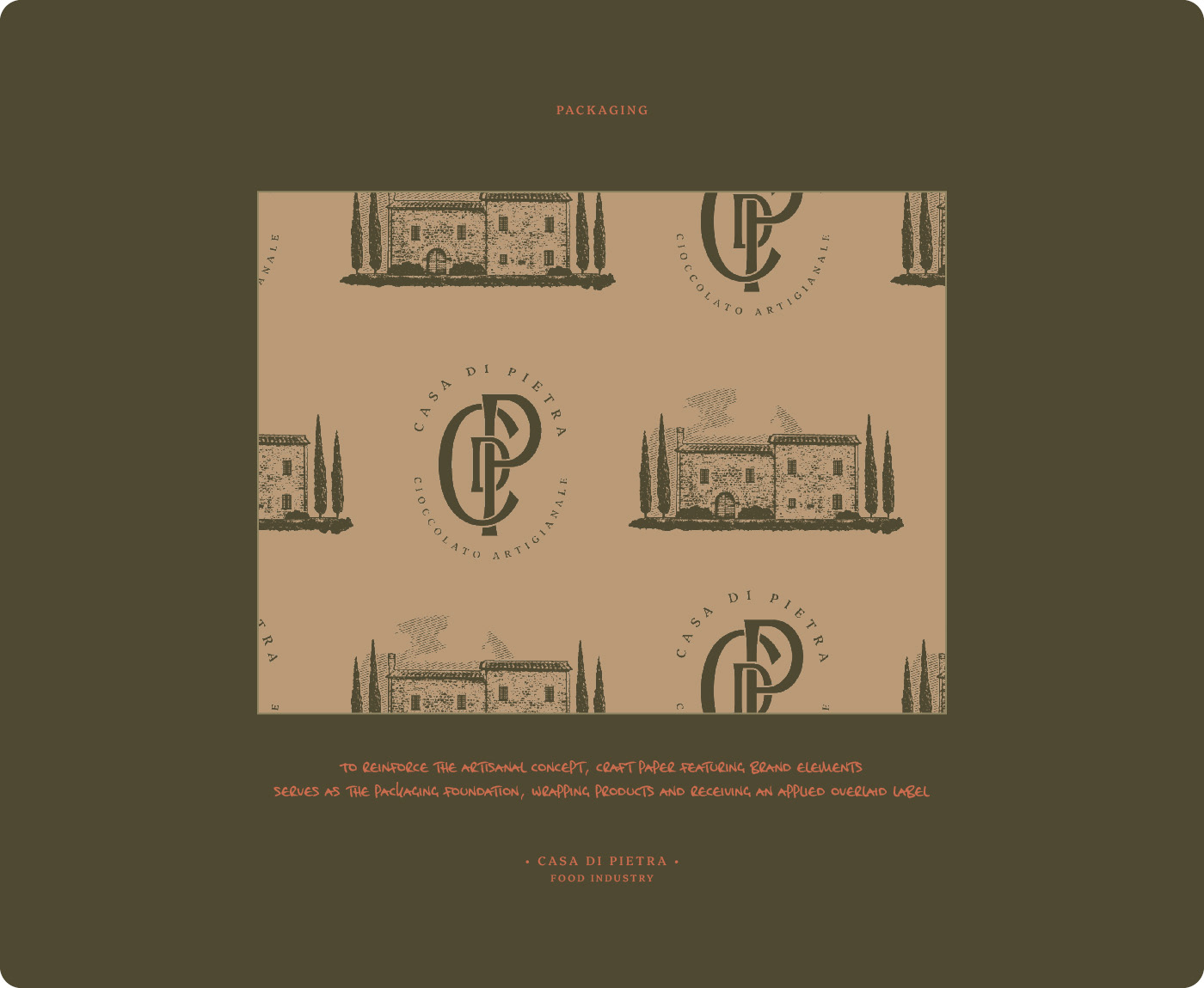
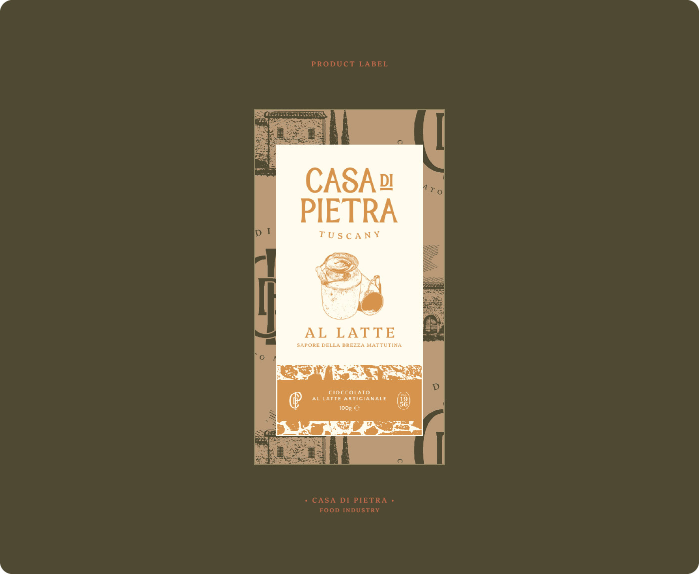
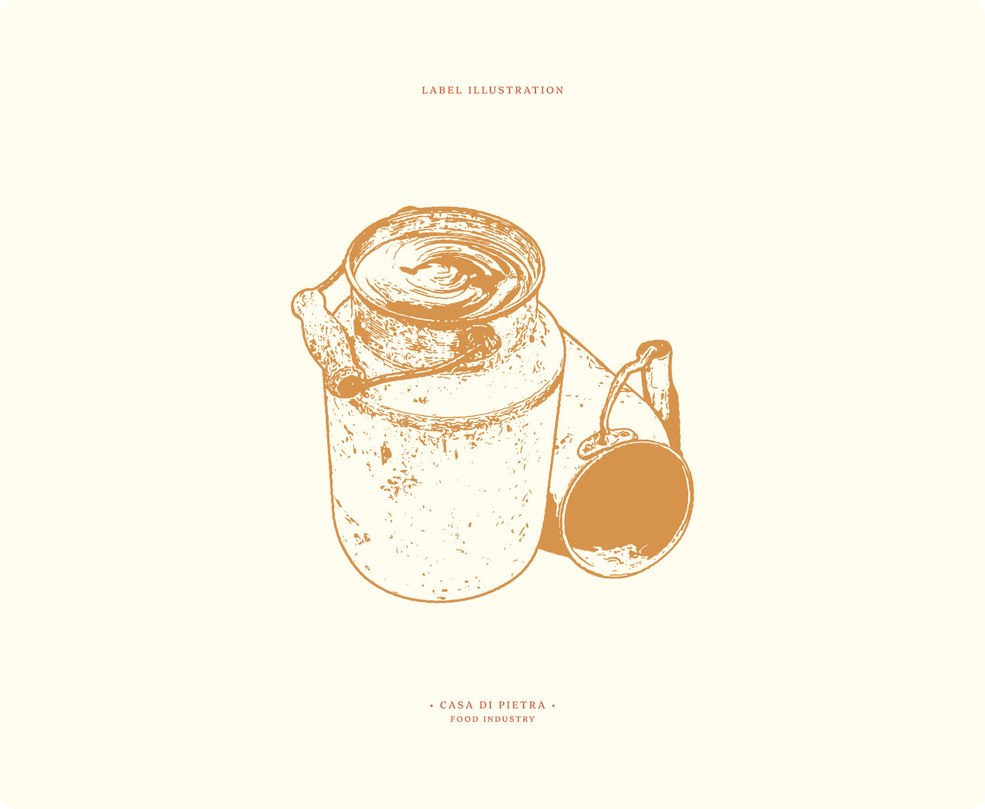
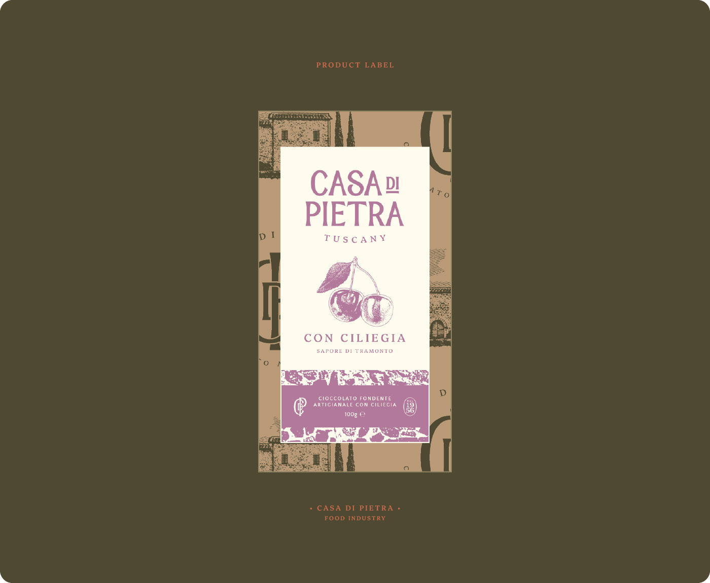
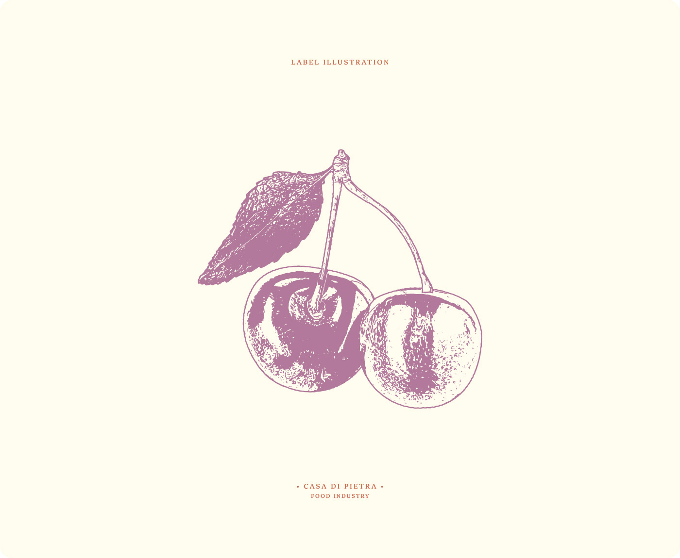
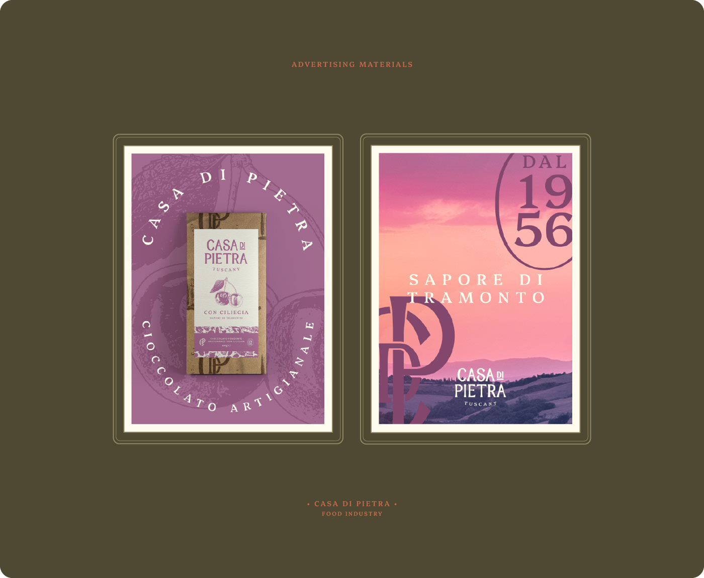
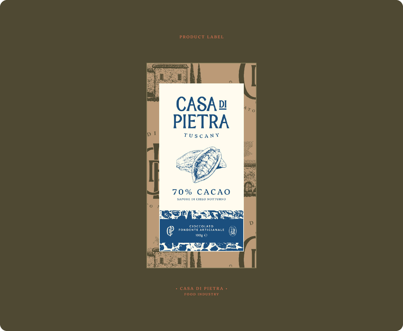
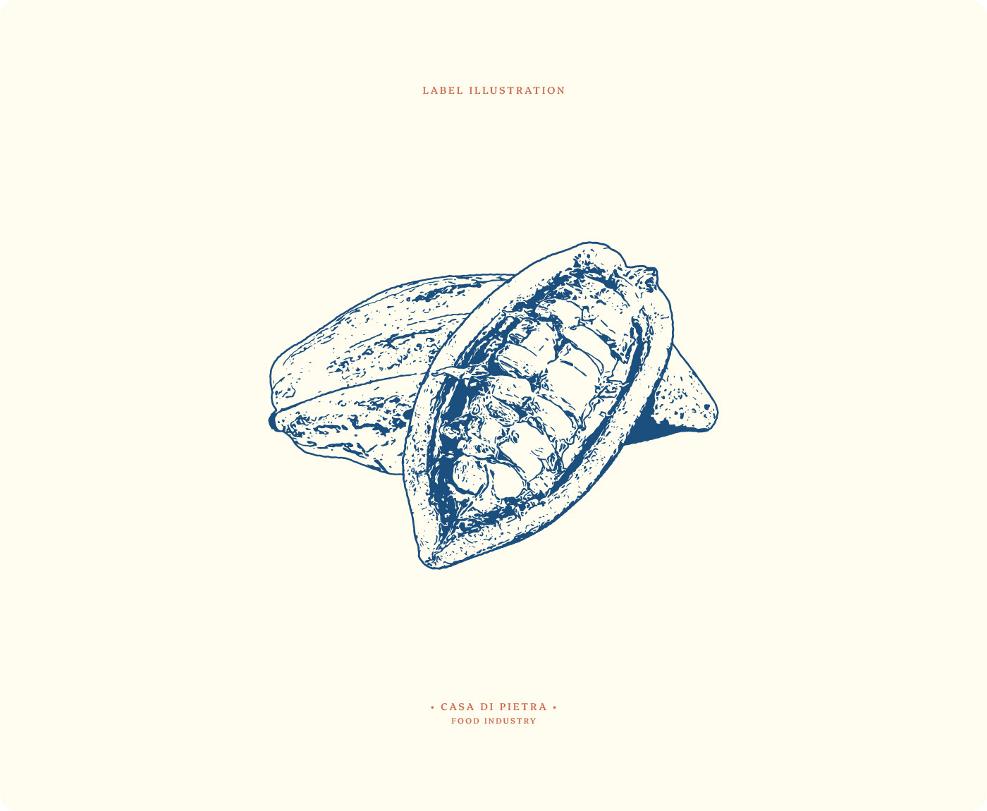
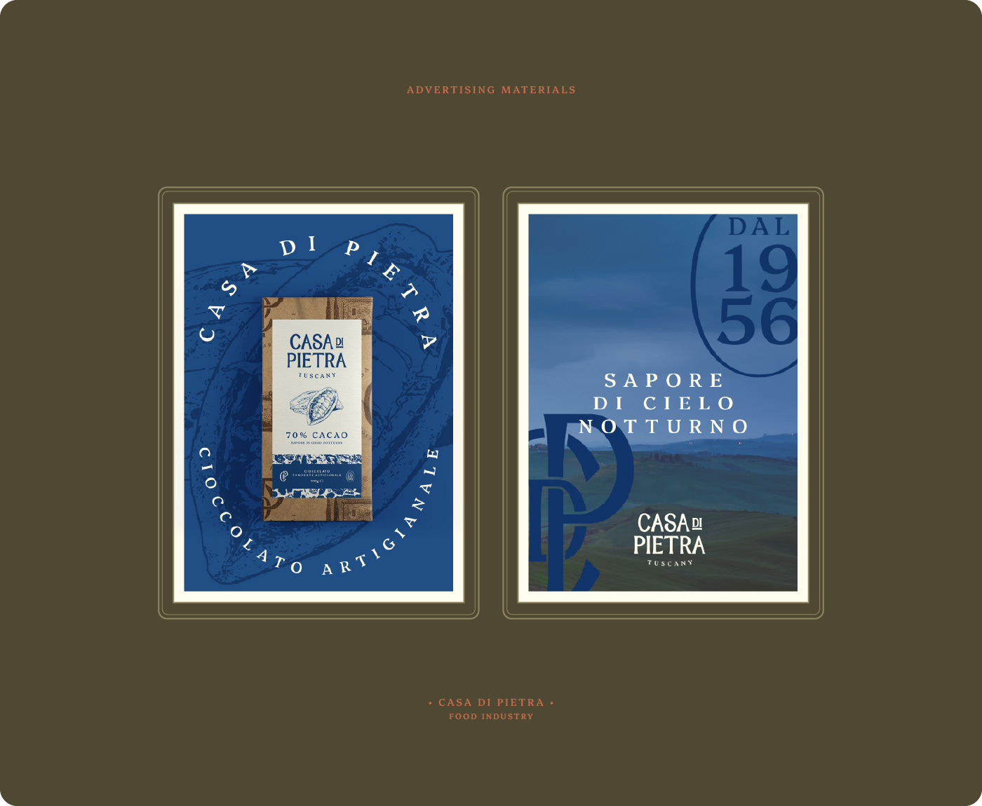
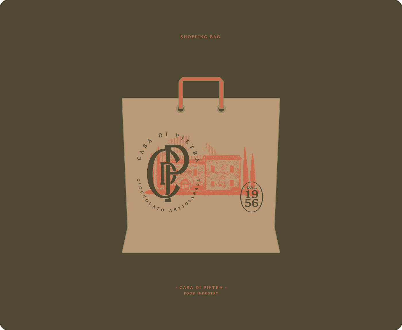
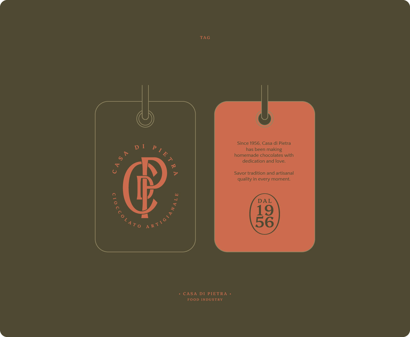
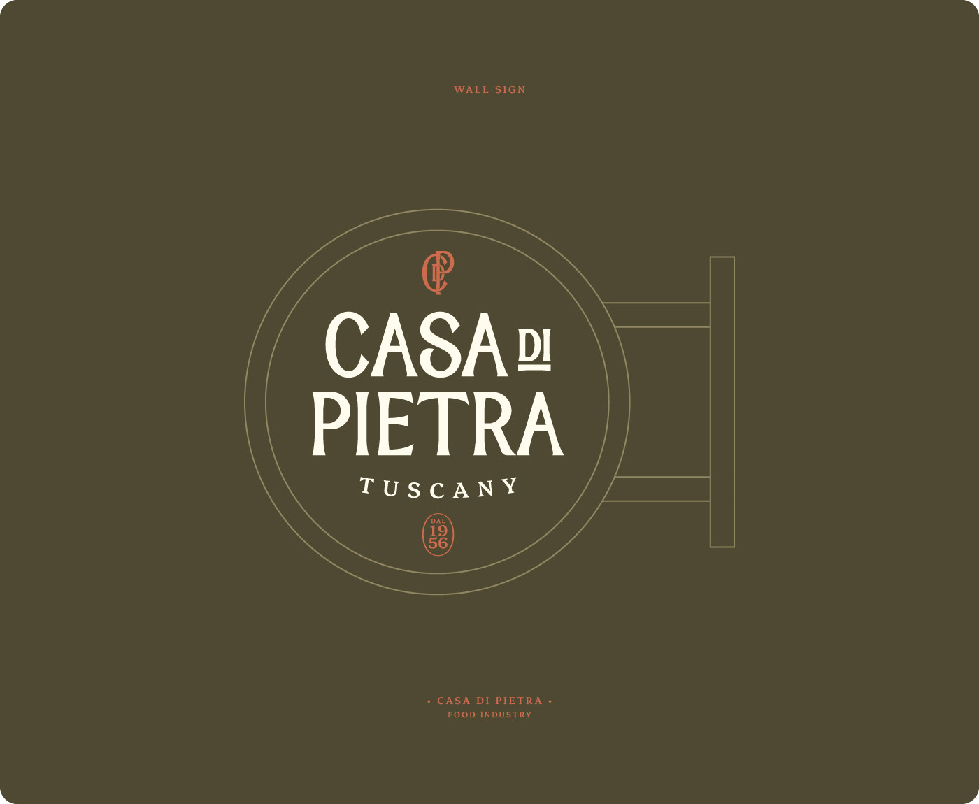
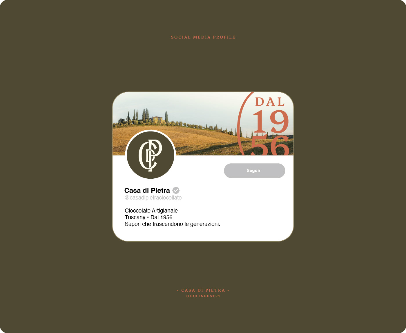
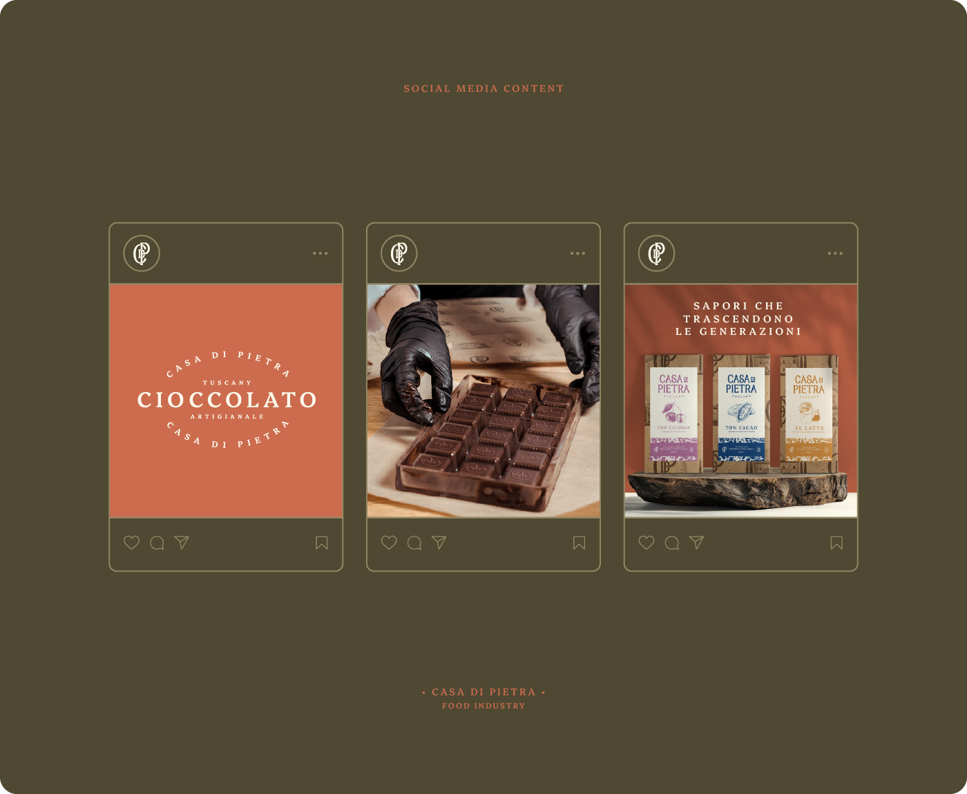
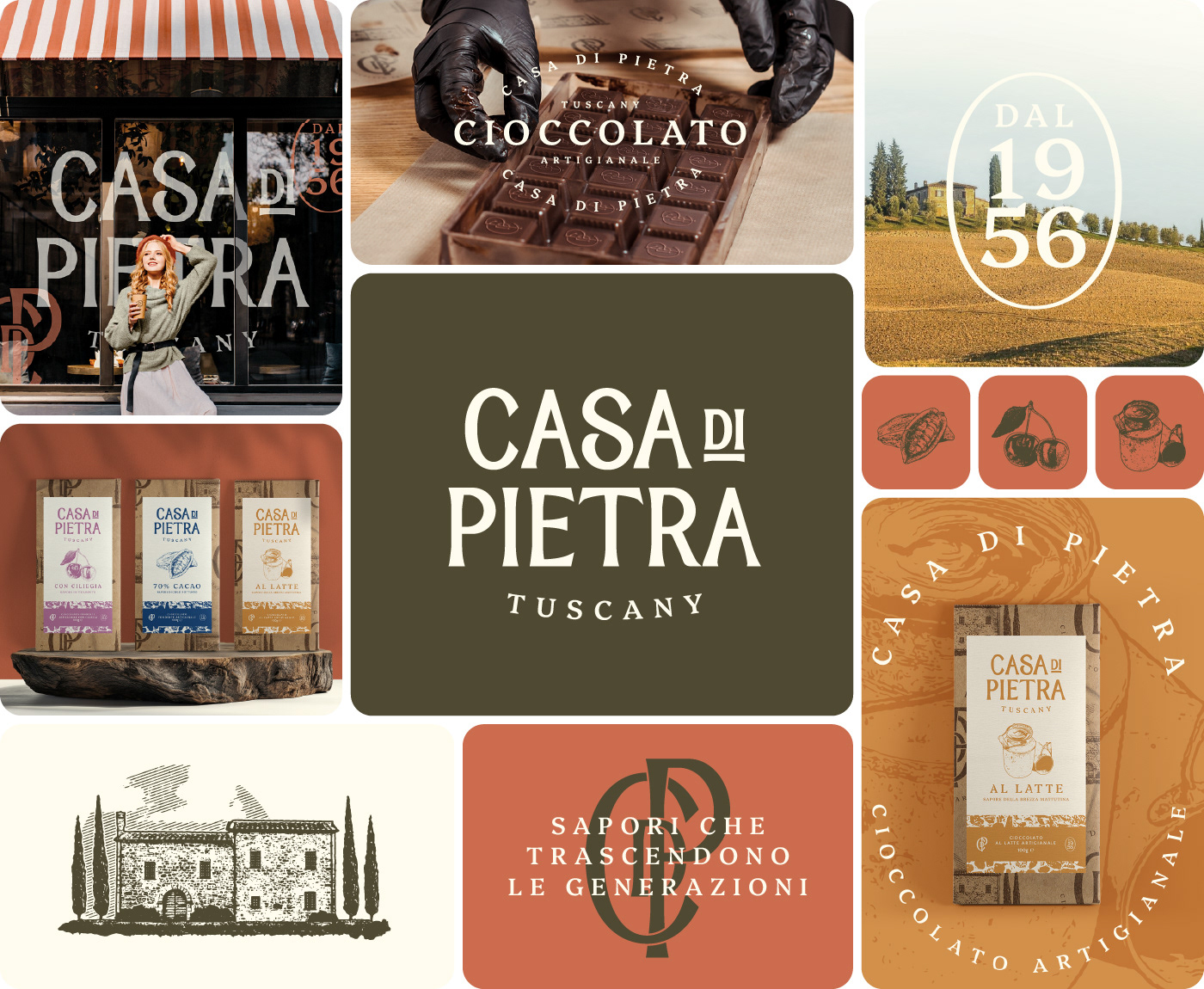
We highlighted the fundamental attributes of Tradition and Artisanal craftsmanship, developing a visual identity that honors grandmother's house - the original location where the first chocolates were made. For the logo, we drew inspiration from Italian wineries, creating a traditional illustration as the main icon, complemented by a sophisticated monogram that functions as the family crest, bringing elegance. The Tuscany landscape-inspired palette evokes authenticity and connection to the land. For packaging, we chose rustic design: natural paper wrapping the chocolate with an overlaid label as the tag.
The brand successfully elevated homemade production to a professional commercial level while maintaining all the emotionality and authenticity of family tradition, creating a narrative that connects consumers to 68 years of history and positions the chocolates as a unique gastronomic experience in the tourism and export market.
Brand Strategy & Visual Identity: Luís Oberherr - Lober Studio